Fix The Brain

Unlock Your Postural Potential

Fix The Body.

.

Fix The Brain

Unlock Your Postural Potential

Fix The Body.

Trusted By

Products & Services

Unlock Your Potential with Our Range of Solutions

Online Certifications

education Online

Upgrade Your Knowledge

Dive deep into posture knowledge at our interactive seminars. Learn directly from the expert, practice hands-on techniques, and engage in enlightening Q&A sessions. Elevate your understanding in a vibrant, face-to-face learning environment.

Products
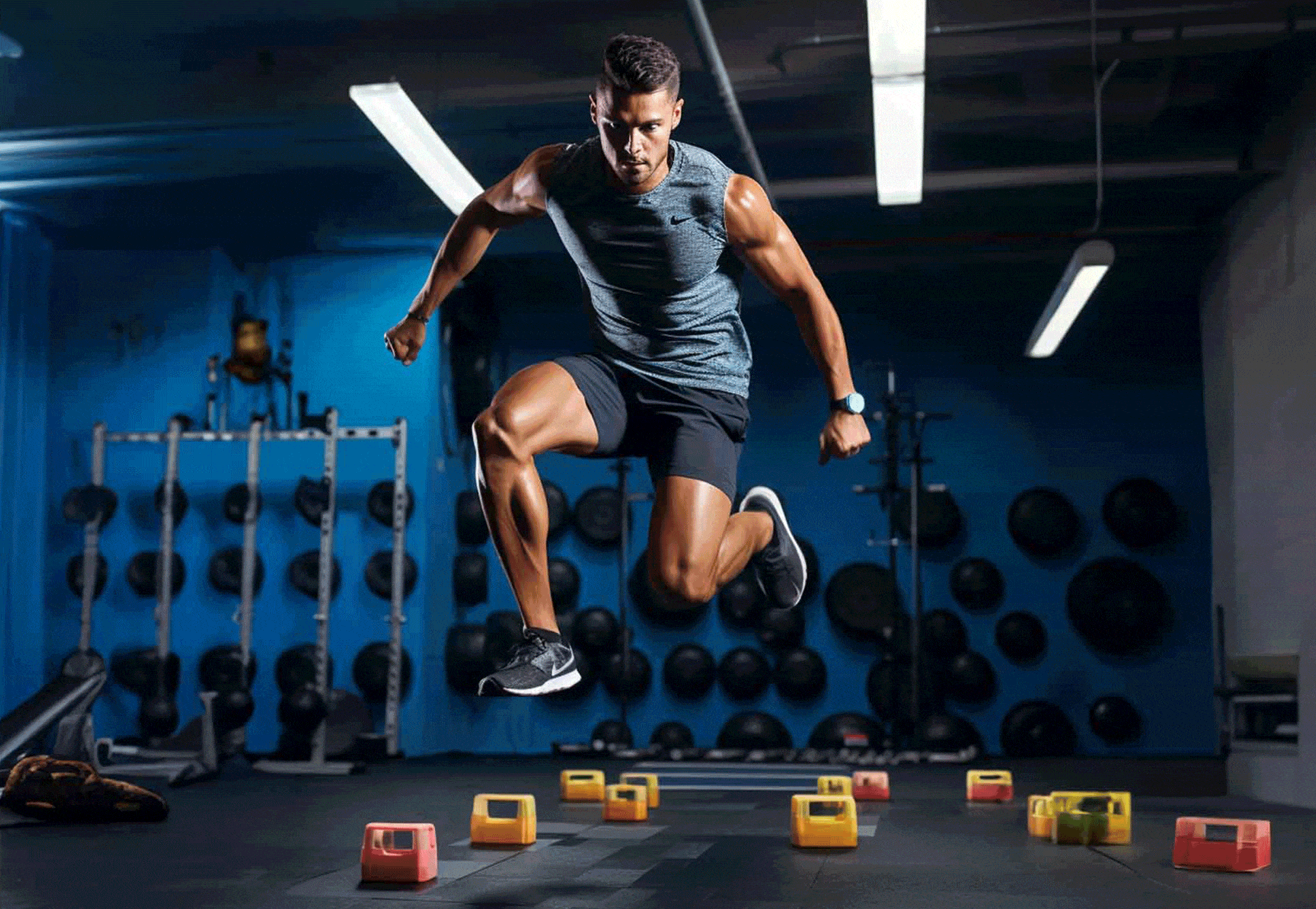
Shop Posturepro

Change The Way You Move

Browse our prime collection of posture-optimizing tools. Focused on enhancing the nervous system, every product is designed for both immediate posture correction and lasting longevity. Witness the transformation in your neural alignment and overall health.

Online Consult
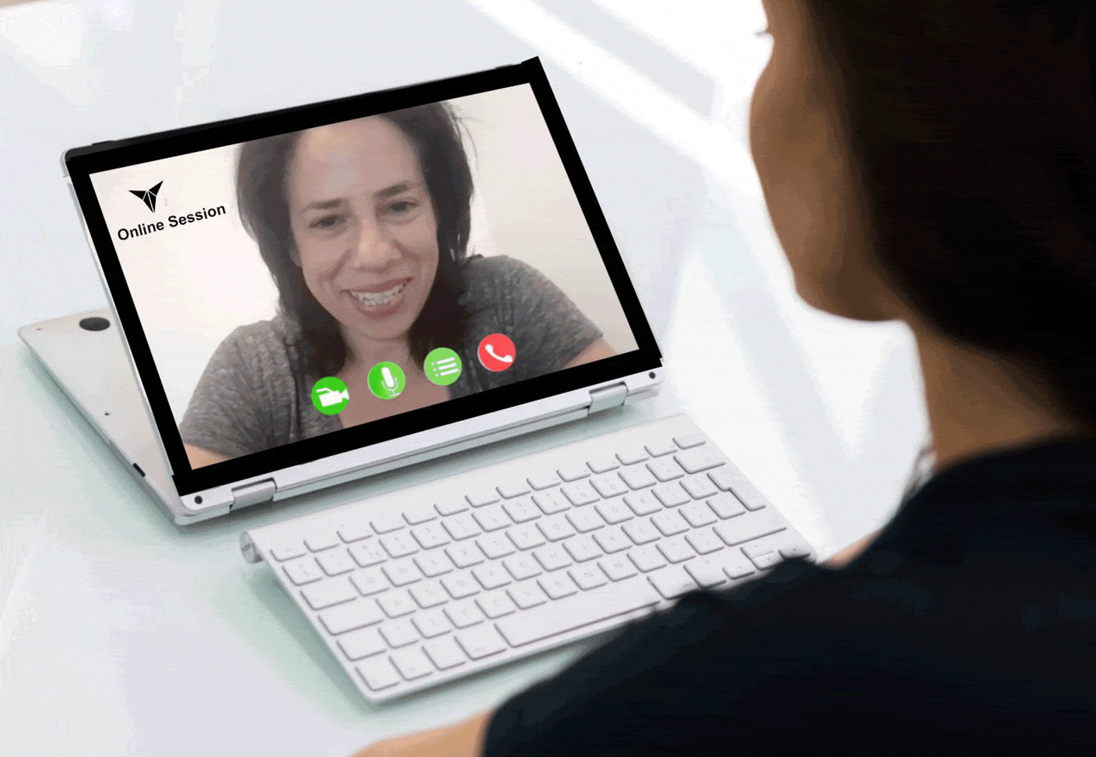
online consultation Annette Verpillot

Anytime, Anywhere

Get personalized consultations from the comfort of your home, no matter where you are on this globe. Experience in-depth, tailored advice to posture correction. Your journey towards impeccable posture starts with just a simple click away.

Trusted By

Revolutionizing the Approach to Health & Wellness

Immediate Skill Application

Implement what you learn right away and witness instant improvement in your client’s wellness, no more waiting for weeks or months to see results.

Cutting-Edge Learning

Stay ahead in the fitness industry with our brain-based rehab techniques, making your services stand out.

Cost-Efficient Investment

With fewer sessions required to see results, not only do your clients save, but you maximize your earnings and referrals.

Revolutionizing the Approach to Health & Wellness

The Missing Link

In the twenty-first century, professionals are taught to assess pain and range of motion using a biomechanical model. While these models consider the anatomy and physiology of the body, they overlook the brain, which is the key controlling system for all movement.

By incorporating neuroscience into systematic testing protocols, we provide a blueprint for your client’s postural posture, addressing the root cause of the problem and correcting faulty motor patterns. Our program, pursued by many therapists, fills the missing link in achieving optimal posture.

About Us

Changing Lives Through the Power of Posture

Our Story

Our approach isn’t a mere theory; it’s anchored in robust scientific research and innovation. We’re at the forefront of preventive neuroplasticity, continually evolving our methods to stay ahead of the curve.

Testimonials

"⭐️ ⭐️ ⭐️ ⭐️ ⭐️ Knowledge Worth Investing In - NeuroVision has transformed my approach to patient care, shedding light on overlooked aspects of health. An invaluable resource! Michael V. - "Masterful Teaching" NeuroVision is a masterclass in understanding the brain's influence on posture. It's revolutionized my approach to care."

Kyle

"⭐️ ⭐️ ⭐️ ⭐️ ⭐️ Life-Changing Comfort - For someone with arthritis, these therapeutic insoles are a blessing. Walking and moving is painless now. Highly recommended!"

Bob K.

"⭐️ ⭐️ ⭐️ ⭐️ ⭐️ I did a zoom consultation with Annette and experienced tension relief in my neck that felt like 50 pounds were taken off my shoulders. No massage or other therapies gave me relief like this and I was able to do it myself which is even better. Everything she told me makes sense and in all the years Ive been trying to get pain relief nobody has ever considered my eyes or feet and how it all connects. Very happy so far."

Steven P. 

Frequently Asked Questions

What makes Posturepro Method different than other training systems?

Posturepro is an integrated curriculum designed for ambitious professionals in the top 1% who seek to seamlessly merge neurology and performance enhancement into their work. The Posturepro Method serves as the foundation for the entire curriculum, focusing specifically on posture correction. By adopting a neuro lens to examine pain and performance, this approach will transform your practice and training, equipping you with effective tools and assessments to enhance movement, posture, motor control, and overall stability for all individuals. While traditional therapy methods prioritize the musculoskeletal system, the Posturepro Method prioritizes the brain’s communication with the musculoskeletal system. This holistic approach allows you to address the body as a whole, effectively modifying faulty motor patterns and delivering immediate, long-lasting results for your clients.

Why does Posturepro Method focus primarily on the Central Nervous System (CNS)?
The Posturepro Method understands the vital connection between your brain and body. By optimizing the information to your central nervous system, you can unlock improvements in range of motion, reaction time, stability, power, strength, mobility, and speed. The brain controls everything you do, and the quality of your movements relies on the involuntary system that supports it. Years of compensation can lead to faulty motor patterns, but reprogramming the central nervous system opens the door to positive change. Trust in Posturepro to help you unleash the power of your body and achieve optimal results.
How is Posture Related To Your Pain?
Posture and imbalances stem from the brain’s communication with muscles. Our brain uses sensory information from the body to determine how to best position us in space. Over time, habitual movement patterns, injuries, or prolonged sitting can lead to changes in this sensory input. This can cause the brain to adapt by adjusting muscle tone and posture, leading to imbalances. For instance, if one foot has reduced sensory feedback, the brain might compensate by shifting more weight to the other side, leading to asymmetry. Through time, these adaptations can become the “new normal” for the brain, embedding these postural changes and imbalances. By addressing the source of this sensory disruption, we can help the brain recalibrate and restore balance.
How Can Posturepro Help Me?
Posturepro utilizes a groundbreaking brain-based model of care for complex neurological and body conditions that have traditionally posed significant challenges. By seamlessly integrating therapeutic brain techniques with personalized physical care, we facilitate accelerated healing and long-lasting wellness. As a team of industry-leading multidisciplinary healthcare specialists, we not only provide exceptional care to our patients, but also serve as educators, sharing our innovative approach with healthcare professionals worldwide. Our brain-based methodology is poised to become the gold standard in rehabilitative care, delivering superior outcomes. With our unparalleled collaboration and wealth of expertise, we effectively address even the most formidable cases, ensuring individuals can maintain optimal health. By entrusting us with your healthcare needs, you and your loved ones gain a lifelong partner for your wellness journey.
/*** === Pixie Free About Page Layout=== ***/ /*** Designed, Built & Created By Divi Den - https://seku.re/divi-den ***/ /*** Get Divi Theme Here: https://seku.re/get-divi ***/ /*** Make Someting Cool wioth Divi? Submit Your Site and WIN! - Free Entry: https://seku.re/showcase ***/ /*** Go To Divi Den Knowlege Base - https://seku.re/kb ***/ /*** Get Support Here: https://seku.re/support ***/ /*** Get Unlimited Automatic Computer Backups (incl. connected drives) for just $5 per month - 14day trial https://seku.re/unlimited-backup ***/ /** HEADER **/ #page-container .pixie-about-freebie-header { padding: 5vw 0 5vw !important; } @media only screen and (max-width: 980px) { #page-container .pixie-about-freebie-header .et_pb_promo_description { padding-bottom: 0 !important; text-align: center !important; } #page-container .pixie-about-freebie-header { padding: 100px 0 !important; } #page-container .pixie-about-freebie-header .et_pb_button_wrapper { text-align: center !important; } #page-container .pixie-about-freebie-header .et_pb_space { margin: 0 auto 20px !important; } #page-container .pixie-about-freebie-header .et_pb_promo_description h2 { padding-bottom: 30px !important; text-align: center !important; } } @media only screen and (max-width: 767px) { #page-container .pixie-about-freebie-header { padding: 60px 0 !important; } } @media only screen and (max-width: 480px) { #page-container .pixie-about-freebie-header .et_pb_promo.et_pb_promo .et_pb_button.et_pb_promo_button { padding: 15px 40px !important; } } /** CONTENT **/ .pixie-about-freebie-content p strong{ color: #000 !important; } .pixie-about-freebie-content .et_pb_column_2_3 .et_pb_image img { display: block !important; width: 100% !important; } .pixie-about-freebie-content .et_pb_column_1_3 { width: 34% !important; } .pixie-about-freebie-content .et_pb_column_2_3 { width: 57% !important; margin-right: 8.7% !important; } .pixie-about-freebie-content .et_pb_blurb { cursor: pointer; } /*Responsive*/ @media only screen and (max-width: 1390px) { .pixie-about-freebie-content .et_pb_column_1_4 .et_pb_blurb { max-width: 100% !important; margin: 0 !important; } .pixie-about-freebie-content .et_pb_column_1_4 { padding-left: 0 !important; } .pixie-about-freebie-content .et_pb_row { width: 90% !important; } .pixie-about-freebie-content .et_pb_column_2_3 { width: 57% !important; margin-right: 4% !important; } .pixie-about-freebie-content .et_pb_column_1_3 { width: 39% !important; padding-top: 0 !important; } } @media only screen and (max-width: 980px) { .pixie-about-freebie-content .et_pb_column_1_3 { width: 47% !important; } .pixie-about-freebie-content .et_pb_column_2_3 { width: 49% !important; margin-right: 4% !important; } } @media only screen and (max-width: 767px) { .pixie-about-freebie-content .et_pb_column_1_3 { width: 100% !important; } .pixie-about-freebie-content .et_pb_column_2_3 { width: 100% !important; margin-right: 0 !important; } } @media only screen and (max-width: 480px) { #page-container .pixie-about-freebie-content .et_pb_column_1_4:not(:last-child) { margin-bottom: 30px !important; } } .pixie-about-freebie-content .et_pb_blurb:hover .et_pb_blurb_description { -webkit-animation: fadeIn 5s infinite; animation: fadeIn 1s infinite; animation-iteration-count: 1 } .pixie-about-freebie-content .et_pb_blurb .et_pb_blurb_container h4 { transition: 0.3s; } /*Hover*/ .pixie-about-freebie-content .et_pb_blurb .et_pb_blurb_container h4, .pixie-about-freebie-content .et_pb_blurb .et_pb_blurb_description { transition-delay: 0.3s; } .pixie-about-freebie-content .et_pb_blurb_container h4:after { display: block; content: ""; width: 0; height: 1px; margin: 20px 0 -20px; transition-delay: 0s; } .pixie-about-freebie-content .et_pb_blurb:hover .et_pb_blurb_container h4 { transform: translate(0, -6px); transition-delay: 0s !important; } .pixie-about-freebie-content .et_pb_blurb:hover .et_pb_blurb_container h4:after { width: 100%; transition-delay: 0.3s; } .pixie-about-freebie-content .et_pb_blurb:hover .et_pb_blurb_description { transform: translate(0, 6px); transition-delay: 0s; } /** BLURB **/ .pixie-about-freebie-blurb .et_pb_blurb { cursor: pointer; } .pixie-about-freebie-blurb .et_pb_blurb_container h4:before { content: "$"; display: inline-block; font-family: ETmodules; font-weight: 300; vertical-align: middle; width: 0; overflow: hidden; transition: 0.3s !important; } .pixie-about-freebie-blurb .et_pb_blurb:hover .et_pb_blurb_container h4:before { width: 30px !important; } .pixie-about-freebie-blurb .et_pb_blurb:hover .et_pb_blurb_container { -webkit-animation: fadeIn 0.8s infinite; animation: fadeIn 0.8s infinite; animation-iteration-count: 1; } .pixie-about-freebie-blurb .et_pb_blurb .et_pb_blurb_container { padding-left: 41px; } /*Responsive*/ @media only screen and (max-width: 980px) { .pixie-about-freebie-blurb .et_pb_column_1_2 { width: 50% !important; } #page-container .pixie-about-freebie-blurb .et_pb_blurb { padding: 30px !important; } .pixie-about-freebie-blurb .et_pb_blurb .et_pb_main_blurb_image { display: block !important; margin: 0 auto 10px !important; } .pixie-about-freebie-blurb .et_pb_blurb .et_pb_blurb_container { display: block !important; padding: 0 !important; text-align: center !important; } } @media only screen and (max-width: 767px) { #page-container .pixie-about-freebie-blurb .et_pb_blurb { padding: 20px !important; } .pixie-about-freebie-blurb .et_pb_row { border: none !important; } .pixie-about-freebie-blurb .et_pb_column_1_2 { width: 100% !important; border-right: none !important; border-bottom: 1px solid #e7e7e7; } .pixie-about-freebie-blurb .et_pb_row:last-child .et_pb_column_1_2:last-child { border: none !important; margin-bottom: 0 !important; } } /** BLOG **/ /*General*/ .pixie-about-freebie-blog .et_pb_posts article:nth-child(2n + 1) { clear: both; } .pixie-about-freebie-blog .et_pb_posts article:nth-child(2n + 2), .pixie-about-freebie-blog .et_pb_posts article:last-child { margin-right: 0 !important; } .pixie-about-freebie-blog .et_pb_posts article { width: 47% !important; margin-right: 6% !important; float: left; clear: none; border: none !important; } .pixie-about-freebie-blog .et_pb_posts article .entry-featured-image-url img { display: block !important; width: 100% !important; } .pixie-about-freebie-blog .et_pb_posts article a[rel="category tag"]:not(:last-of-type):after { content: ","; display: inline-block; margin-right: 5px; } .pixie-about-freebie-blog .et_pb_posts article a.more-link, .pixie-about-freebie-blog .et_pb_posts article .post-meta a, .pixie-about-freebie-blog .et_pb_posts article a[rel="category tag"] { transition: 0.3s; } .pixie-about-freebie-blog .et_pb_posts article a.more-link:hover, .pixie-about-freebie-blog .et_pb_posts article .post-meta a:hover, .pixie-about-freebie-blog .et_pb_posts article .categories a:hover { opacity: 0.5; } /*Blog 1*/ .pixie-about-freebie-blog .et_pb_posts article .post-content { padding-bottom: 3.4vw !important; padding-left: 0.3vw; padding-top: 9px; line-height: 160%; } .pixie-about-freebie-blog .et_pb_posts article .post-meta .published { position: absolute; bottom: 6px; right: 0; } .pixie-about-freebie-blog .et_pb_posts article .post-meta .author.vcard { border-top: 1px solid #ebebeb; border-bottom: 1px solid #ebebeb; margin-top: 24px; padding: 3px 0 0; display: block; position: absolute; bottom: 0; left: 0.3vw; width: 100%; } .pixie-about-freebie-blog .et_pb_posts article .post-meta .published, .pixie-about-freebie-blog .et_pb_posts article .post-meta .author.vcard a { text-transform: capitalize !important; } .pixie-about-freebie-blog .et_pb_posts article .post-meta .published:before { vertical-align: middle; } .pixie-about-freebie-blog .et_pb_posts article .post-meta .published:before, .pixie-about-freebie-blog .et_pb_posts article .post-meta .author.vcard a:before { font-family: ETmodules; text-transform: lowercase; margin-right: 9px; color: #a7a7a7; font-weight: 700; content: "l"; margin-left: 3px; } .pixie-about-freebie-blog .et_pb_posts article .post-meta .author.vcard a:before { content: "l"; } .pixie-about-freebie-blog .et_pb_posts article .post-meta .published:before { content: ""; } .pixie-about-freebie-blog .et_pb_posts article .post-meta .published { font-size: 16px; } .pixie-about-freebie-blog .et_pb_posts article .post-meta { margin-bottom: 0 !important; font-size: 0; padding-left: 0.3vw !important; } .pixie-about-freebie-blog .et_pb_posts article h2.entry-title { margin-top: 19px; padding-left: 0.3vw; } /*Hovers*/ .pixie-about-freebie-blog .et_pb_posts article .entry-featured-image-url:after, .pixie-about-freebie-blog .et_pb_posts article .entry-featured-image-url:before { transition: 0.3s; } .pixie-about-freebie-blog .et_pb_posts article { cursor: pointer; } .pixie-about-freebie-blog .et_pb_posts article .entry-featured-image-url { overflow: hidden; margin-bottom: 0 !important; background-color: #000 !important; } .pixie-about-freebie-blog .et_pb_posts article:hover:before { width: 32%; opacity: 1; } .pixie-about-freebie-blog .et_pb_posts article:before { content: ''; display: block; opacity: 0; position: absolute; width: 0%; border-top: 1px solid #fff; z-index: 1; top: 179px; height: 0; left: 5vw; transition: 0.3s; } .pixie-about-freebie-blog .et_pb_posts article .entry-featured-image-url:before { content: ''; display: block; opacity: 0; position: absolute; top: 0; left: 0; bottom: 0; right: 0; border: 1px solid #fff; z-index: 1; } .pixie-about-freebie-blog .et_pb_posts article .entry-featured-image-url:after { content: 'Read More'; display: block; opacity: 0; position: absolute; top: 50%; color: #fff; transform: translate(80%, -50%); width: 80%; font-size: 24px; text-align: right; font-family: 'Playfair Display', Georgia, "Times New Roman", serif !important; } .pixie-about-freebie-blog .et_pb_posts article:hover .entry-featured-image-url:after { opacity: 1; transform: translate(0, -50%); } .pixie-about-freebie-blog .et_pb_posts article:hover .entry-featured-image-url:before { transition-delay: 0.3s; opacity: 1; top: 20px; left: 20px; bottom: 20px; right: 20px; } .pixie-about-freebie-blog .et_pb_posts article:hover .entry-featured-image-url img { opacity: 0.5 !important; } .pixie-about-freebie-blog article:hover .post-content, .pixie-about-freebie-blog article:hover .post-meta, .pixie-about-freebie-blog article:hover h2.entry-title { -webkit-animation: fadeIn 0.8s infinite; /* Safari 4.0 - 8.0 */ animation: fadeIn 0.8s infinite; animation-iteration-count: 1; } @-webkit-keyframes fadeIn { from { opacity: 0.5; } to { opacity: 1; } } @keyframes fadeIn { from { opacity: 0.5; } to { opacity: 1; } } .fadeIn { -webkit-animation-name: fadeIn; animation-name: fadeIn; } .pixie-about-freebie-blog .et_pb_posts article .entry-featured-image-url { max-height: 344px; } /*Responsive*/ @media only screen and (max-width: 1450px) { .pixie-about-freebie-blog .et_pb_posts article .entry-featured-image-url { max-height: 238px; } .pixie-about-freebie-blog .et_pb_posts article:before { top: 119px; } .pixie-about-freebie-blog .et_pb_posts article:hover:before { width: 26%; } } @media only screen and (max-width: 1390px) { .pixie-about-freebie-blog .et_pb_posts article .bottom_box .author.vcard a, .pixie-about-freebie-blog .et_pb_posts article .bottom_box span.comment { text-transform: capitalize !important; display: inline-block; } .pixie-about-freebie-blog .et_pb_posts article .post-content { padding-bottom: 70px !important; } } @media only screen and (max-width: 980px) { .pixie-about-freebie-blog .et_pb_posts article .entry-featured-image-url { max-height: 186px; } .pixie-about-freebie-blog .et_pb_posts article:before { top: 94px; } .pixie-about-freebie-blog .et_pb_posts article:hover:before { width: 23%; } } @media only screen and (max-width: 767px) { .pixie-about-freebie-blog .et_pb_posts article h2.entry-title { height: auto !important; } .pixie-about-freebie-blog .et_pb_posts article { width: 100% !important; margin-right: 0 !important; float: none; } .pixie-about-freebie-blog .et_pb_posts article .entry-featured-image-url { max-height: 248px; } .pixie-about-freebie-blog .et_pb_posts article:before { top: 125px; left: 50px; } .pixie-about-freebie-blog .et_pb_posts article:hover:before { width: 30%; } } @media only screen and (max-width: 480px) { .pixie-about-freebie-blog .et_pb_posts article .entry-featured-image-url { max-height: 175px; } .pixie-about-freebie-blog .et_pb_posts article .entry-featured-image-url:after { font-size: 16px !important; } .pixie-about-freebie-blog .et_pb_posts article:before { top: 89px; left: 50px; } } /** FOOTER **/ /*General*/ .pixie-about-freebie-footer a { color: inherit !important; } .pixie-about-freebie-footer a:hover { opacity: 0.5 !important; } /* Change color of social media icons */ .pixie-about-freebie-footer .et_pb_social_media_follow li a.icon::before { color: #fff; } /*** Footers Colored Links ***/ #page-container .pixie-about-freebie-footer .et_pb_newsletter_form p:last-of-type { width: 29% !important; } #page-container .pixie-about-freebie-footer .et_pb_newsletter_form p:first-of-type { width: 65.5% !important; margin-right: 5.2%; } /*Columnes*/ #page-container .pixie-about-freebie-footer .et_pb_column_1_4:last-child { width: 33% !important; } #page-container .pixie-about-freebie-footer .et_pb_column_1_4 { width: 16% !important; } /*Focus*/ .pixie-about-freebie-footer .et_pb_newsletter p { padding-bottom: 0 !important; } @media only screen and (max-width: 1390px) { #page-container .pixie-about-freebie-footer .et_pb_newsletter { padding-left: 0 !important; } #page-container .pixie-about-freebie-footer .et_pb_newsletter .et_pb_newsletter_button.et_pb_button { padding: 10px 1vw !important; } } @media only screen and (max-width: 1390px) and (min-width: 981px) { #page-container .pixie-about-freebie-footer .et_pb_column_1_2 .et_pb_text_inner { font-size: 28px !important; } } @media only screen and (max-width: 980px) { #page-container .pixie-about-freebie-footer .et_pb_newsletter_form { display: block !important; width: 100% !important; padding-left: 0 !important; } #page-container .pixie-about-freebie-footer .et_pb_newsletter_form p:first-of-type { width: 65% !important; margin-right: 5%; float: left; } #page-container .pixie-about-freebie-footer .et_pb_newsletter_form p:last-of-type { width: 30% !important; float: left; } #page-container .pixie-about-freebie-footer .et_pb_column_1_2 .et_pb_text_inner { text-align: center !important; } #page-container .pixie-about-freebie-footer .et_pb_column_1_4:last-child { width: 25% !important; } #page-container .pixie-about-freebie-footer .et_pb_column_1_4 { width: 22% !important; margin-right: 2%; } #page-container .pixie-about-freebie-footer .et_pb_column_1_2 .et_pb_text_inner { margin-bottom: 10px !important; } } @media only screen and (max-width: 767px) { #page-container .pixie-about-freebie-footer .et_pb_column_1_4:last-child { width: 48% !important; } #page-container .pixie-about-freebie-footer .et_pb_column_1_4 { width: 48% !important; margin-right: 4%; } #page-container .pixie-about-freebie-footer .et_pb_column_1_4:nth-child(2n + 2) { margin-right: 0 !important; } #page-container .pixie-about-freebie-footer .et_pb_column_1_4 .et_pb_social_media_follow { margin-left: -12px; } #page-container .pixie-about-freebie-footer .et_pb_column_1_4 .et_pb_social_media_follow, #page-container .pixie-about-freebie-footer .et_pb_column_1_4 .et_pb_text { text-align: left !important; } #page-container .pixie-about-freebie-footer .et_pb_column_4_4 .et_pb_text { text-align: center !important; padding: 0 !important; } .pixie-about-freebie-footer .et_pb_row:last-child .et_pb_text a { display: inline-block; } } @media only screen and (max-width: 480px) { #page-container .pixie-about-freebie-footer .et_pb_column_1_4 .et_pb_social_media_follow, #page-container .pixie-about-freebie-footer .et_pb_column_1_4 .et_pb_text, #page-container .pixie-about-freebie-footer .et_pb_column_1_4 .et_pb_promo, #page-container .pixie-about-freebie-footer .et_pb_column_1_4 .et_pb_promo h2 { text-align: center !important; } #page-container .pixie-about-freebie-footer .et_pb_column_1_4 .et_pb_promo h2 { padding-bottom: 15px !important; } #page-container .pixie-about-freebie-footer .et_pb_column_1_4 .et_pb_text { margin-bottom: 20px !important; } #page-container .pixie-about-freebie-footer .et_pb_column_1_4 { margin-bottom: 30px !important; } #page-container .pixie-about-freebie-footer .et_pb_column_1_4:last-child { width: 100% !important; margin-bottom: 0 !important; } #page-container .pixie-about-freebie-footer .et_pb_newsletter_form p:first-of-type { width: 100% !important; margin-right: 0; position: relative; margin-bottom: 20px; } #page-container .pixie-about-freebie-footer .et_pb_newsletter_form p:last-of-type { width: 100% !important; } }

QUESTIONS ABOUT OUR PROGRAM?

BOOK A FREE CALL WITH ANNETTE

Posturepro’s BLOG

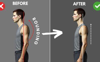
3 Exercises to Fix Rounded Shoulders

3 Exercises to Fix Rounded Shoulders

3 Proven Exercises to Instantly Fix Rounded ShouldersThe term rounded shoulders is used to describe a resting shoulder position that has moved forward from the body's ideal alignment. Rounded shoulders, sometimes known as "mom posture," are part of overall bad...

DOWNLOAD THE POSTUREPRO APP

Posturepro App Store

Posturepro © 2024 - All Rights Reserved. |  Privacy Policy

DOWNLOAD THE POSTUREPRO APP

Posturepro App Store

Posturepro © 2024 - All Rights Reserved. |  Privacy Policy

/*** === Pixie Free About Page Layout=== ***/ /*** Designed, Built & Created By Divi Den - https://seku.re/divi-den ***/ /*** Get Divi Theme Here: https://seku.re/get-divi ***/ /*** Make Someting Cool wioth Divi? Submit Your Site and WIN! - Free Entry: https://seku.re/showcase ***/ /*** Go To Divi Den Knowlege Base - https://seku.re/kb ***/ /*** Get Support Here: https://seku.re/support ***/ /*** Get Unlimited Automatic Computer Backups (incl. connected drives) for just $5 per month - 14day trial https://seku.re/unlimited-backup ***/ /** HEADER **/ #page-container .pixie-about-freebie-header { padding: 5vw 0 5vw !important; } @media only screen and (max-width: 980px) { #page-container .pixie-about-freebie-header .et_pb_promo_description { padding-bottom: 0 !important; text-align: center !important; } #page-container .pixie-about-freebie-header { padding: 100px 0 !important; } #page-container .pixie-about-freebie-header .et_pb_button_wrapper { text-align: center !important; } #page-container .pixie-about-freebie-header .et_pb_space { margin: 0 auto 20px !important; } #page-container .pixie-about-freebie-header .et_pb_promo_description h2 { padding-bottom: 30px !important; text-align: center !important; } } @media only screen and (max-width: 767px) { #page-container .pixie-about-freebie-header { padding: 60px 0 !important; } } @media only screen and (max-width: 480px) { #page-container .pixie-about-freebie-header .et_pb_promo.et_pb_promo .et_pb_button.et_pb_promo_button { padding: 15px 40px !important; } } /** CONTENT **/ .pixie-about-freebie-content p strong{ color: #000 !important; } .pixie-about-freebie-content .et_pb_column_2_3 .et_pb_image img { display: block !important; width: 100% !important; } .pixie-about-freebie-content .et_pb_column_1_3 { width: 34% !important; } .pixie-about-freebie-content .et_pb_column_2_3 { width: 57% !important; margin-right: 8.7% !important; } .pixie-about-freebie-content .et_pb_blurb { cursor: pointer; } /*Responsive*/ @media only screen and (max-width: 1390px) { .pixie-about-freebie-content .et_pb_column_1_4 .et_pb_blurb { max-width: 100% !important; margin: 0 !important; } .pixie-about-freebie-content .et_pb_column_1_4 { padding-left: 0 !important; } .pixie-about-freebie-content .et_pb_row { width: 90% !important; } .pixie-about-freebie-content .et_pb_column_2_3 { width: 57% !important; margin-right: 4% !important; } .pixie-about-freebie-content .et_pb_column_1_3 { width: 39% !important; padding-top: 0 !important; } } @media only screen and (max-width: 980px) { .pixie-about-freebie-content .et_pb_column_1_3 { width: 47% !important; } .pixie-about-freebie-content .et_pb_column_2_3 { width: 49% !important; margin-right: 4% !important; } } @media only screen and (max-width: 767px) { .pixie-about-freebie-content .et_pb_column_1_3 { width: 100% !important; } .pixie-about-freebie-content .et_pb_column_2_3 { width: 100% !important; margin-right: 0 !important; } } @media only screen and (max-width: 480px) { #page-container .pixie-about-freebie-content .et_pb_column_1_4:not(:last-child) { margin-bottom: 30px !important; } } .pixie-about-freebie-content .et_pb_blurb:hover .et_pb_blurb_description { -webkit-animation: fadeIn 5s infinite; animation: fadeIn 1s infinite; animation-iteration-count: 1 } .pixie-about-freebie-content .et_pb_blurb .et_pb_blurb_container h4 { transition: 0.3s; } /*Hover*/ .pixie-about-freebie-content .et_pb_blurb .et_pb_blurb_container h4, .pixie-about-freebie-content .et_pb_blurb .et_pb_blurb_description { transition-delay: 0.3s; } .pixie-about-freebie-content .et_pb_blurb_container h4:after { display: block; content: ""; width: 0; height: 1px; margin: 20px 0 -20px; transition-delay: 0s; } .pixie-about-freebie-content .et_pb_blurb:hover .et_pb_blurb_container h4 { transform: translate(0, -6px); transition-delay: 0s !important; } .pixie-about-freebie-content .et_pb_blurb:hover .et_pb_blurb_container h4:after { width: 100%; transition-delay: 0.3s; } .pixie-about-freebie-content .et_pb_blurb:hover .et_pb_blurb_description { transform: translate(0, 6px); transition-delay: 0s; } /** BLURB **/ .pixie-about-freebie-blurb .et_pb_blurb { cursor: pointer; } .pixie-about-freebie-blurb .et_pb_blurb_container h4:before { content: "$"; display: inline-block; font-family: ETmodules; font-weight: 300; vertical-align: middle; width: 0; overflow: hidden; transition: 0.3s !important; } .pixie-about-freebie-blurb .et_pb_blurb:hover .et_pb_blurb_container h4:before { width: 30px !important; } .pixie-about-freebie-blurb .et_pb_blurb:hover .et_pb_blurb_container { -webkit-animation: fadeIn 0.8s infinite; animation: fadeIn 0.8s infinite; animation-iteration-count: 1; } .pixie-about-freebie-blurb .et_pb_blurb .et_pb_blurb_container { padding-left: 41px; } /*Responsive*/ @media only screen and (max-width: 980px) { .pixie-about-freebie-blurb .et_pb_column_1_2 { width: 50% !important; } #page-container .pixie-about-freebie-blurb .et_pb_blurb { padding: 30px !important; } .pixie-about-freebie-blurb .et_pb_blurb .et_pb_main_blurb_image { display: block !important; margin: 0 auto 10px !important; } .pixie-about-freebie-blurb .et_pb_blurb .et_pb_blurb_container { display: block !important; padding: 0 !important; text-align: center !important; } } @media only screen and (max-width: 767px) { #page-container .pixie-about-freebie-blurb .et_pb_blurb { padding: 20px !important; } .pixie-about-freebie-blurb .et_pb_row { border: none !important; } .pixie-about-freebie-blurb .et_pb_column_1_2 { width: 100% !important; border-right: none !important; border-bottom: 1px solid #e7e7e7; } .pixie-about-freebie-blurb .et_pb_row:last-child .et_pb_column_1_2:last-child { border: none !important; margin-bottom: 0 !important; } } /** BLOG **/ /*General*/ .pixie-about-freebie-blog .et_pb_posts article:nth-child(2n + 1) { clear: both; } .pixie-about-freebie-blog .et_pb_posts article:nth-child(2n + 2), .pixie-about-freebie-blog .et_pb_posts article:last-child { margin-right: 0 !important; } .pixie-about-freebie-blog .et_pb_posts article { width: 47% !important; margin-right: 6% !important; float: left; clear: none; border: none !important; } .pixie-about-freebie-blog .et_pb_posts article .entry-featured-image-url img { display: block !important; width: 100% !important; } .pixie-about-freebie-blog .et_pb_posts article a[rel="category tag"]:not(:last-of-type):after { content: ","; display: inline-block; margin-right: 5px; } .pixie-about-freebie-blog .et_pb_posts article a.more-link, .pixie-about-freebie-blog .et_pb_posts article .post-meta a, .pixie-about-freebie-blog .et_pb_posts article a[rel="category tag"] { transition: 0.3s; } .pixie-about-freebie-blog .et_pb_posts article a.more-link:hover, .pixie-about-freebie-blog .et_pb_posts article .post-meta a:hover, .pixie-about-freebie-blog .et_pb_posts article .categories a:hover { opacity: 0.5; } /*Blog 1*/ .pixie-about-freebie-blog .et_pb_posts article .post-content { padding-bottom: 3.4vw !important; padding-left: 0.3vw; padding-top: 9px; line-height: 160%; } .pixie-about-freebie-blog .et_pb_posts article .post-meta .published { position: absolute; bottom: 6px; right: 0; } .pixie-about-freebie-blog .et_pb_posts article .post-meta .author.vcard { border-top: 1px solid #ebebeb; border-bottom: 1px solid #ebebeb; margin-top: 24px; padding: 3px 0 0; display: block; position: absolute; bottom: 0; left: 0.3vw; width: 100%; } .pixie-about-freebie-blog .et_pb_posts article .post-meta .published, .pixie-about-freebie-blog .et_pb_posts article .post-meta .author.vcard a { text-transform: capitalize !important; } .pixie-about-freebie-blog .et_pb_posts article .post-meta .published:before { vertical-align: middle; } .pixie-about-freebie-blog .et_pb_posts article .post-meta .published:before, .pixie-about-freebie-blog .et_pb_posts article .post-meta .author.vcard a:before { font-family: ETmodules; text-transform: lowercase; margin-right: 9px; color: #a7a7a7; font-weight: 700; content: "l"; margin-left: 3px; } .pixie-about-freebie-blog .et_pb_posts article .post-meta .author.vcard a:before { content: "l"; } .pixie-about-freebie-blog .et_pb_posts article .post-meta .published:before { content: ""; } .pixie-about-freebie-blog .et_pb_posts article .post-meta .published { font-size: 16px; } .pixie-about-freebie-blog .et_pb_posts article .post-meta { margin-bottom: 0 !important; font-size: 0; padding-left: 0.3vw !important; } .pixie-about-freebie-blog .et_pb_posts article h2.entry-title { margin-top: 19px; padding-left: 0.3vw; } /*Hovers*/ .pixie-about-freebie-blog .et_pb_posts article .entry-featured-image-url:after, .pixie-about-freebie-blog .et_pb_posts article .entry-featured-image-url:before { transition: 0.3s; } .pixie-about-freebie-blog .et_pb_posts article { cursor: pointer; } .pixie-about-freebie-blog .et_pb_posts article .entry-featured-image-url { overflow: hidden; margin-bottom: 0 !important; background-color: #000 !important; } .pixie-about-freebie-blog .et_pb_posts article:hover:before { width: 32%; opacity: 1; } .pixie-about-freebie-blog .et_pb_posts article:before { content: ''; display: block; opacity: 0; position: absolute; width: 0%; border-top: 1px solid #fff; z-index: 1; top: 179px; height: 0; left: 5vw; transition: 0.3s; } .pixie-about-freebie-blog .et_pb_posts article .entry-featured-image-url:before { content: ''; display: block; opacity: 0; position: absolute; top: 0; left: 0; bottom: 0; right: 0; border: 1px solid #fff; z-index: 1; } .pixie-about-freebie-blog .et_pb_posts article .entry-featured-image-url:after { content: 'Read More'; display: block; opacity: 0; position: absolute; top: 50%; color: #fff; transform: translate(80%, -50%); width: 80%; font-size: 24px; text-align: right; font-family: 'Playfair Display', Georgia, "Times New Roman", serif !important; } .pixie-about-freebie-blog .et_pb_posts article:hover .entry-featured-image-url:after { opacity: 1; transform: translate(0, -50%); } .pixie-about-freebie-blog .et_pb_posts article:hover .entry-featured-image-url:before { transition-delay: 0.3s; opacity: 1; top: 20px; left: 20px; bottom: 20px; right: 20px; } .pixie-about-freebie-blog .et_pb_posts article:hover .entry-featured-image-url img { opacity: 0.5 !important; } .pixie-about-freebie-blog article:hover .post-content, .pixie-about-freebie-blog article:hover .post-meta, .pixie-about-freebie-blog article:hover h2.entry-title { -webkit-animation: fadeIn 0.8s infinite; /* Safari 4.0 - 8.0 */ animation: fadeIn 0.8s infinite; animation-iteration-count: 1; } @-webkit-keyframes fadeIn { from { opacity: 0.5; } to { opacity: 1; } } @keyframes fadeIn { from { opacity: 0.5; } to { opacity: 1; } } .fadeIn { -webkit-animation-name: fadeIn; animation-name: fadeIn; } .pixie-about-freebie-blog .et_pb_posts article .entry-featured-image-url { max-height: 344px; } /*Responsive*/ @media only screen and (max-width: 1450px) { .pixie-about-freebie-blog .et_pb_posts article .entry-featured-image-url { max-height: 238px; } .pixie-about-freebie-blog .et_pb_posts article:before { top: 119px; } .pixie-about-freebie-blog .et_pb_posts article:hover:before { width: 26%; } } @media only screen and (max-width: 1390px) { .pixie-about-freebie-blog .et_pb_posts article .bottom_box .author.vcard a, .pixie-about-freebie-blog .et_pb_posts article .bottom_box span.comment { text-transform: capitalize !important; display: inline-block; } .pixie-about-freebie-blog .et_pb_posts article .post-content { padding-bottom: 70px !important; } } @media only screen and (max-width: 980px) { .pixie-about-freebie-blog .et_pb_posts article .entry-featured-image-url { max-height: 186px; } .pixie-about-freebie-blog .et_pb_posts article:before { top: 94px; } .pixie-about-freebie-blog .et_pb_posts article:hover:before { width: 23%; } } @media only screen and (max-width: 767px) { .pixie-about-freebie-blog .et_pb_posts article h2.entry-title { height: auto !important; } .pixie-about-freebie-blog .et_pb_posts article { width: 100% !important; margin-right: 0 !important; float: none; } .pixie-about-freebie-blog .et_pb_posts article .entry-featured-image-url { max-height: 248px; } .pixie-about-freebie-blog .et_pb_posts article:before { top: 125px; left: 50px; } .pixie-about-freebie-blog .et_pb_posts article:hover:before { width: 30%; } } @media only screen and (max-width: 480px) { .pixie-about-freebie-blog .et_pb_posts article .entry-featured-image-url { max-height: 175px; } .pixie-about-freebie-blog .et_pb_posts article .entry-featured-image-url:after { font-size: 16px !important; } .pixie-about-freebie-blog .et_pb_posts article:before { top: 89px; left: 50px; } } /** FOOTER **/ /*General*/ .pixie-about-freebie-footer a { color: inherit !important; } .pixie-about-freebie-footer a:hover { opacity: 0.5 !important; } /* Change color of social media icons */ .pixie-about-freebie-footer .et_pb_social_media_follow li a.icon::before { color: #fff; } /*** Footers Colored Links ***/ #page-container .pixie-about-freebie-footer .et_pb_newsletter_form p:last-of-type { width: 29% !important; } #page-container .pixie-about-freebie-footer .et_pb_newsletter_form p:first-of-type { width: 65.5% !important; margin-right: 5.2%; } /*Columnes*/ #page-container .pixie-about-freebie-footer .et_pb_column_1_4:last-child { width: 33% !important; } #page-container .pixie-about-freebie-footer .et_pb_column_1_4 { width: 16% !important; } /*Focus*/ .pixie-about-freebie-footer .et_pb_newsletter p { padding-bottom: 0 !important; } @media only screen and (max-width: 1390px) { #page-container .pixie-about-freebie-footer .et_pb_newsletter { padding-left: 0 !important; } #page-container .pixie-about-freebie-footer .et_pb_newsletter .et_pb_newsletter_button.et_pb_button { padding: 10px 1vw !important; } } @media only screen and (max-width: 1390px) and (min-width: 981px) { #page-container .pixie-about-freebie-footer .et_pb_column_1_2 .et_pb_text_inner { font-size: 28px !important; } } @media only screen and (max-width: 980px) { #page-container .pixie-about-freebie-footer .et_pb_newsletter_form { display: block !important; width: 100% !important; padding-left: 0 !important; } #page-container .pixie-about-freebie-footer .et_pb_newsletter_form p:first-of-type { width: 65% !important; margin-right: 5%; float: left; } #page-container .pixie-about-freebie-footer .et_pb_newsletter_form p:last-of-type { width: 30% !important; float: left; } #page-container .pixie-about-freebie-footer .et_pb_column_1_2 .et_pb_text_inner { text-align: center !important; } #page-container .pixie-about-freebie-footer .et_pb_column_1_4:last-child { width: 25% !important; } #page-container .pixie-about-freebie-footer .et_pb_column_1_4 { width: 22% !important; margin-right: 2%; } #page-container .pixie-about-freebie-footer .et_pb_column_1_2 .et_pb_text_inner { margin-bottom: 10px !important; } } @media only screen and (max-width: 767px) { #page-container .pixie-about-freebie-footer .et_pb_column_1_4:last-child { width: 48% !important; } #page-container .pixie-about-freebie-footer .et_pb_column_1_4 { width: 48% !important; margin-right: 4%; } #page-container .pixie-about-freebie-footer .et_pb_column_1_4:nth-child(2n + 2) { margin-right: 0 !important; } #page-container .pixie-about-freebie-footer .et_pb_column_1_4 .et_pb_social_media_follow { margin-left: -12px; } #page-container .pixie-about-freebie-footer .et_pb_column_1_4 .et_pb_social_media_follow, #page-container .pixie-about-freebie-footer .et_pb_column_1_4 .et_pb_text { text-align: left !important; } #page-container .pixie-about-freebie-footer .et_pb_column_4_4 .et_pb_text { text-align: center !important; padding: 0 !important; } .pixie-about-freebie-footer .et_pb_row:last-child .et_pb_text a { display: inline-block; } } @media only screen and (max-width: 480px) { #page-container .pixie-about-freebie-footer .et_pb_column_1_4 .et_pb_social_media_follow, #page-container .pixie-about-freebie-footer .et_pb_column_1_4 .et_pb_text, #page-container .pixie-about-freebie-footer .et_pb_column_1_4 .et_pb_promo, #page-container .pixie-about-freebie-footer .et_pb_column_1_4 .et_pb_promo h2 { text-align: center !important; } #page-container .pixie-about-freebie-footer .et_pb_column_1_4 .et_pb_promo h2 { padding-bottom: 15px !important; } #page-container .pixie-about-freebie-footer .et_pb_column_1_4 .et_pb_text { margin-bottom: 20px !important; } #page-container .pixie-about-freebie-footer .et_pb_column_1_4 { margin-bottom: 30px !important; } #page-container .pixie-about-freebie-footer .et_pb_column_1_4:last-child { width: 100% !important; margin-bottom: 0 !important; } #page-container .pixie-about-freebie-footer .et_pb_newsletter_form p:first-of-type { width: 100% !important; margin-right: 0; position: relative; margin-bottom: 20px; } #page-container .pixie-about-freebie-footer .et_pb_newsletter_form p:last-of-type { width: 100% !important; } }